
Sapora
Naming and visual identity for a premium spice, herb and speciality salt brand.


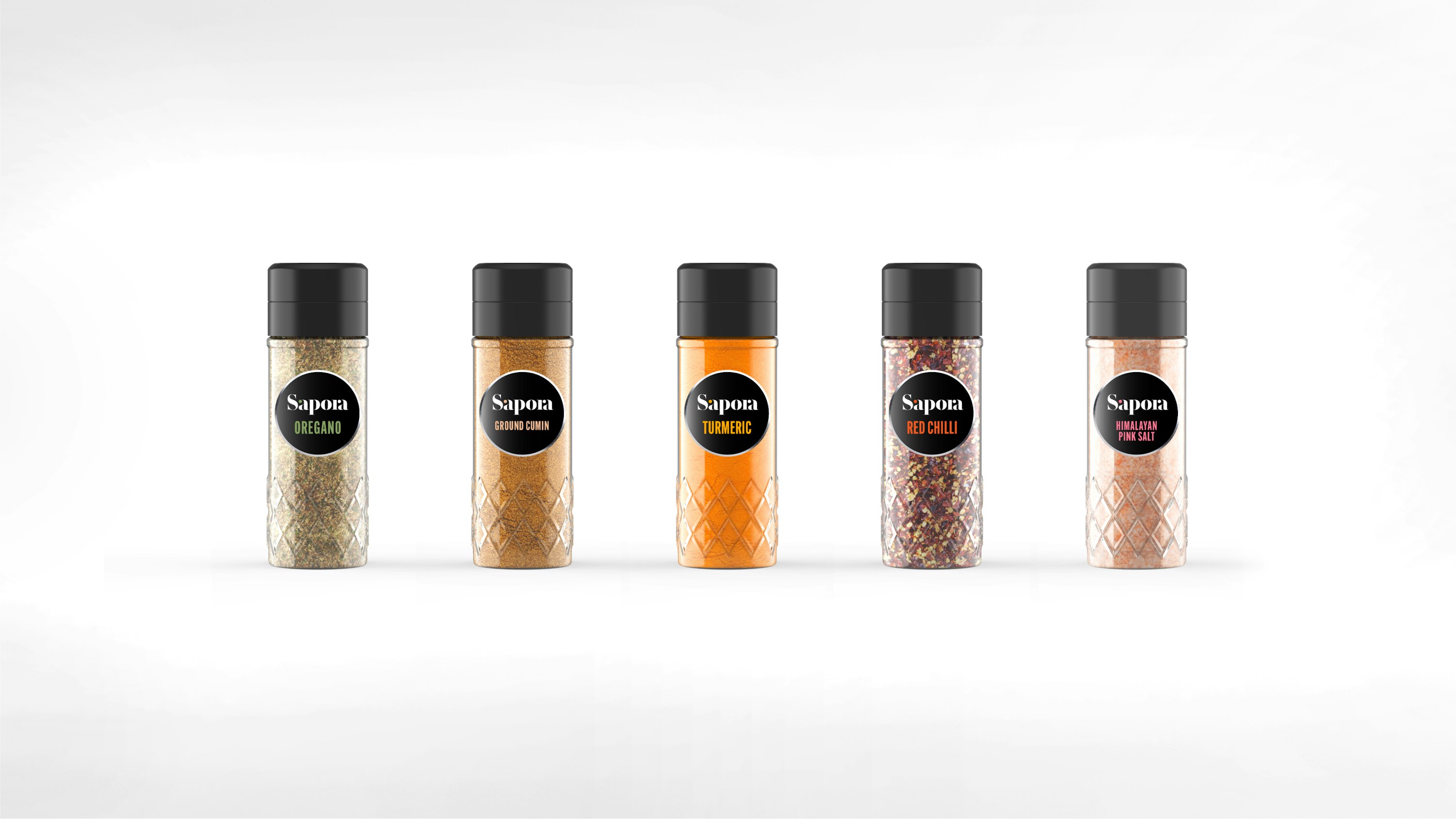


The Sapora logo is inspired by the stencil lettering found on spice freight packaging. A bright red dot features as part of the letter 'a' and represents the intense hit that spice gives to food, adding flavour and pleasure to the gastronomic experience.


The Challenge
Develop a distinctive name and visual identity for a new premium spice brand that would stand out in a competitive market while communicating quality, authenticity, and culinary expertise.
The Solution
We created the name "Sapora," derived from "sapor" (Latin for flavor or taste), and developed a sophisticated visual identity system that emphasizes the brand's commitment to quality and the sensory experience of cooking with premium spices.