
Kate's Butter
Butter is better from Maine.
Kate's Butter is a family-owned creamery that has been making butter the old-fashioned way in Maine for over 30 years. Their commitment to quality, tradition, and sustainable farming practices has made them a beloved brand in New England and beyond.
We partnered with Kate's Butter to refresh their brand identity and packaging, creating a design that honors their heritage while appealing to a new generation of conscious consumers who value authenticity and craftsmanship.
The result is a clean, timeless design that stands out on the shelf and tells the story of Kate's dedication to making the best butter possible, using only the freshest cream from local Maine farms.
Project Details
Client
Kate's Butter
Industry
Food & Beverage
Services
- Brand Strategy
- Brand Identity
- Packaging Design
- Photography Direction
- Website Design
Year
2024

The Challenge
Kate's Butter had built a loyal following in New England with their high-quality, all-natural butter. However, as they expanded into new markets, they needed a brand identity that would communicate their values and heritage to consumers who weren't familiar with their story.
The challenge was to refresh their packaging and brand identity in a way that would honor their tradition and authenticity while standing out in an increasingly competitive dairy case.
The Solution
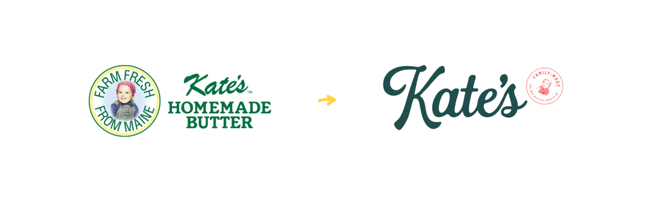
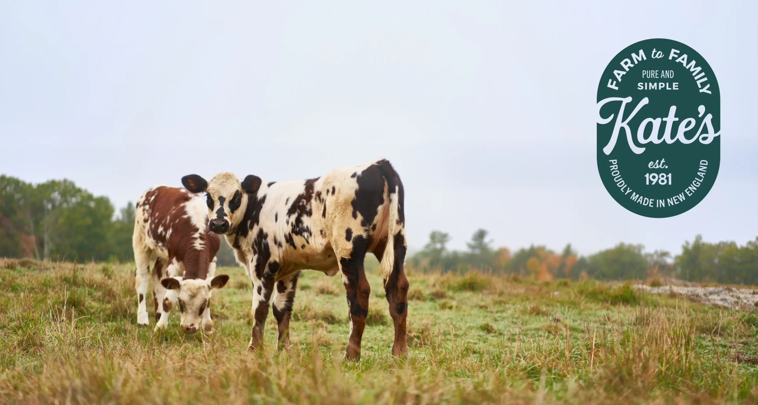
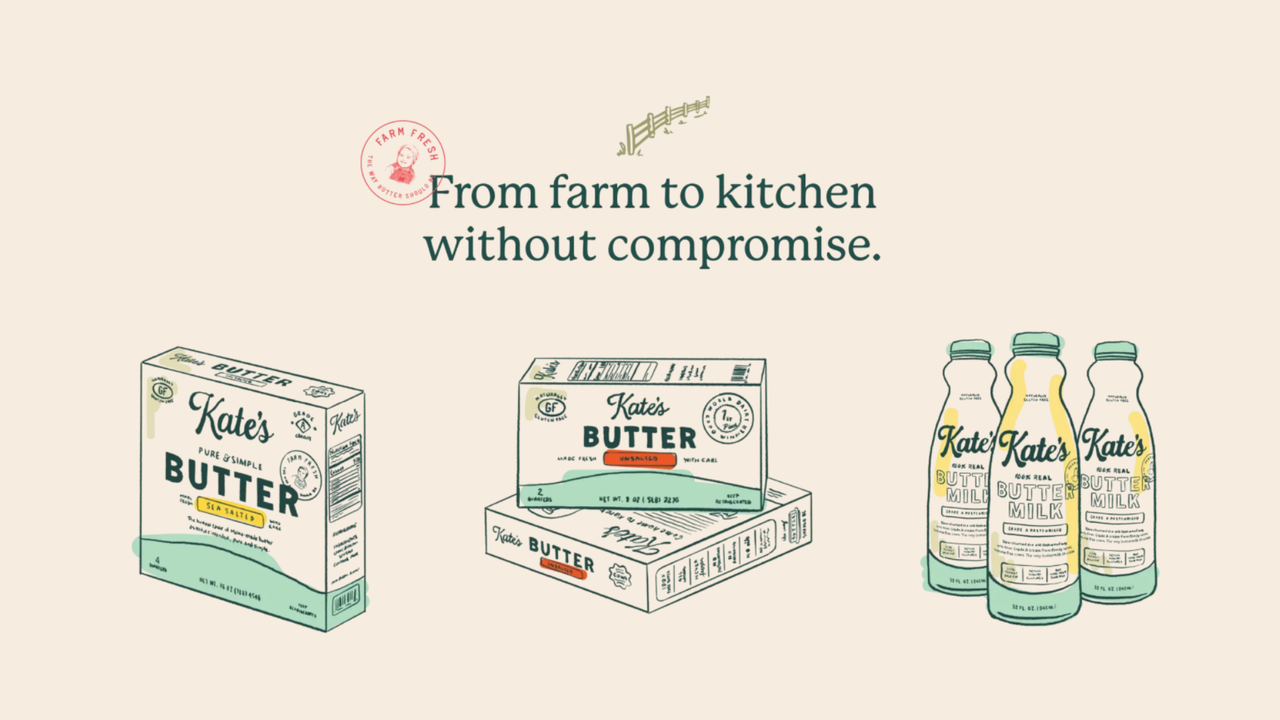
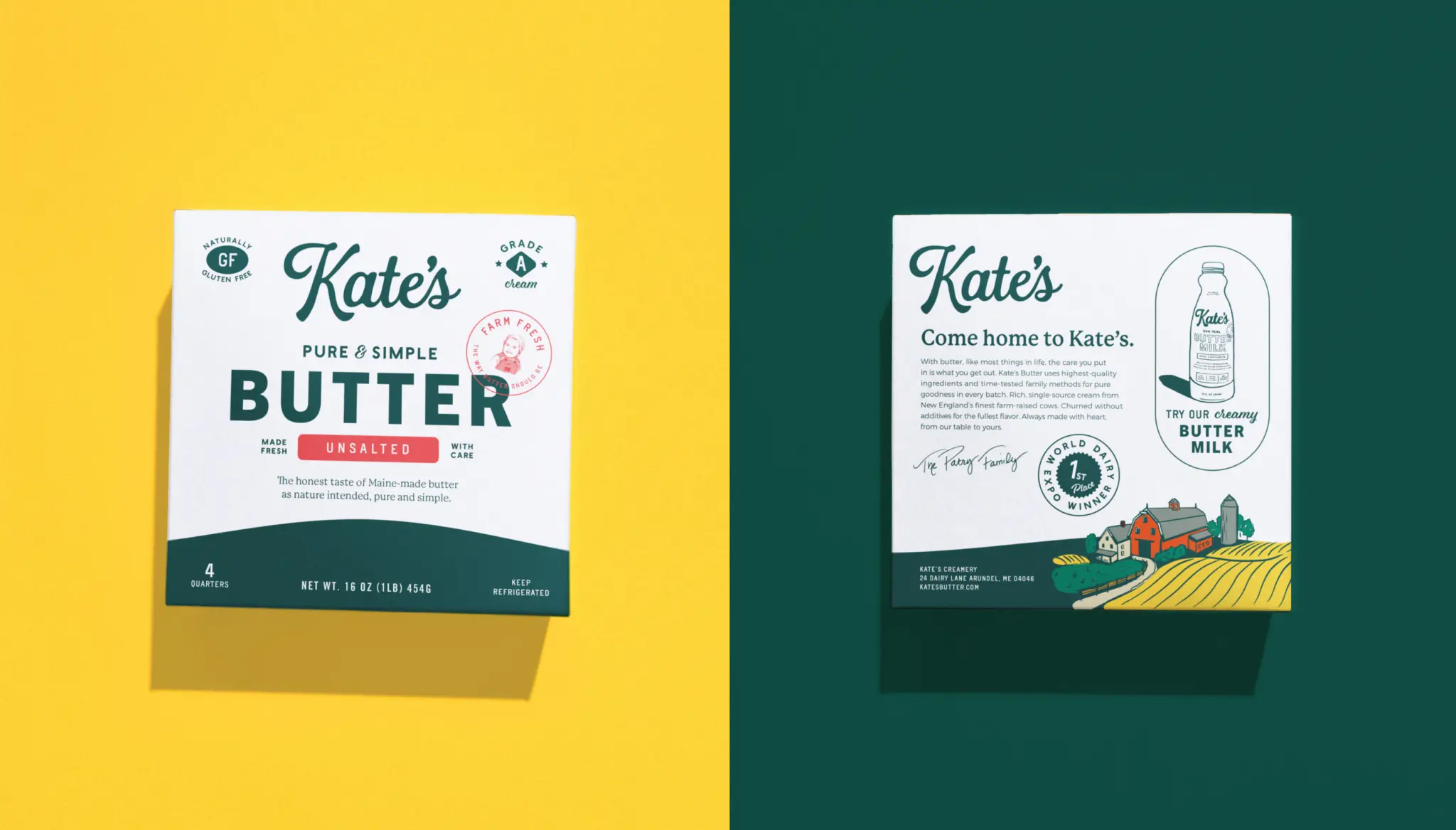
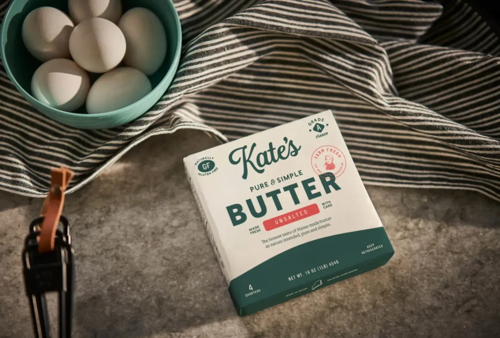
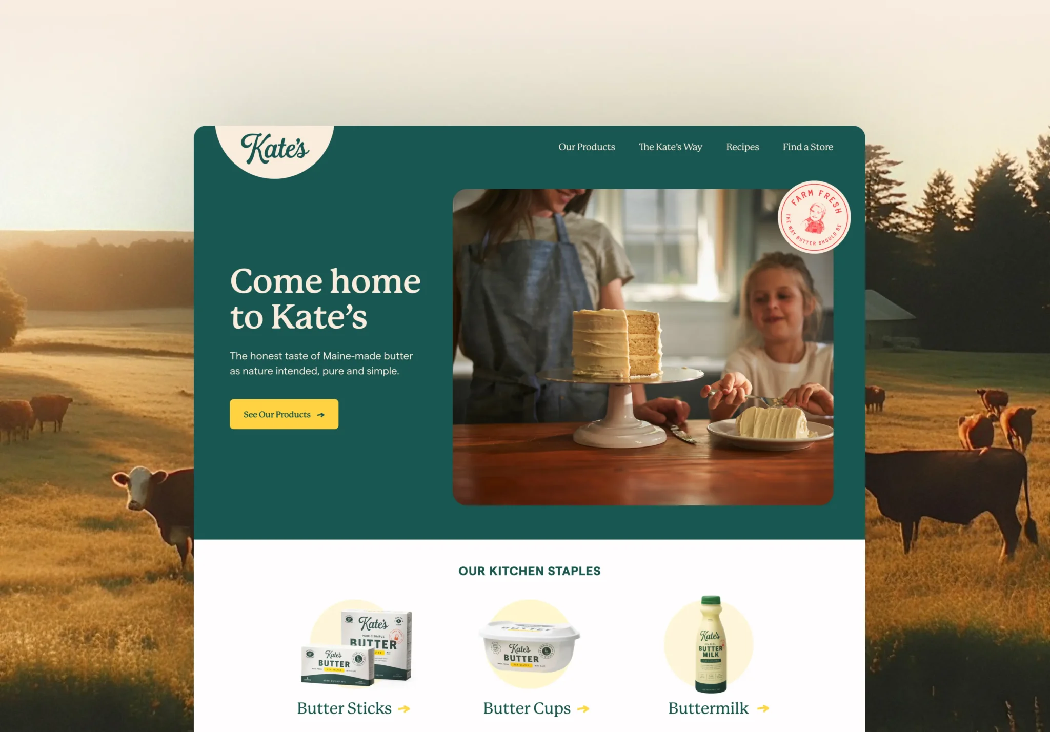
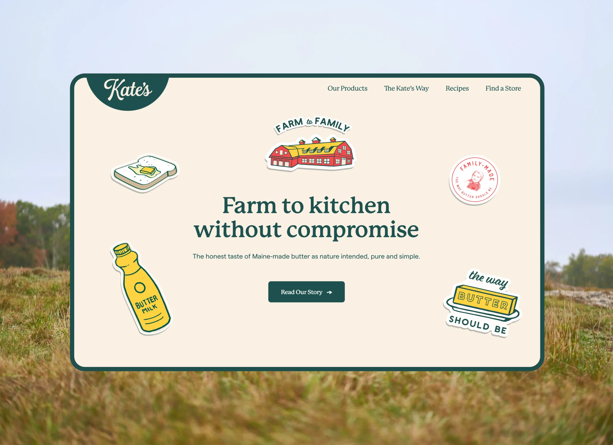
We developed a brand identity that celebrates Kate's Maine roots and commitment to quality. The new packaging features clean, simple typography and a color palette inspired by the natural beauty of Maine's landscape.
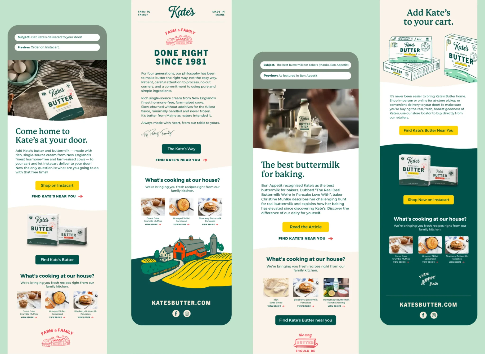
We created a system that works across their entire product line, from butter to cream cheese, ensuring a cohesive brand experience while allowing each product to have its own distinct identity.
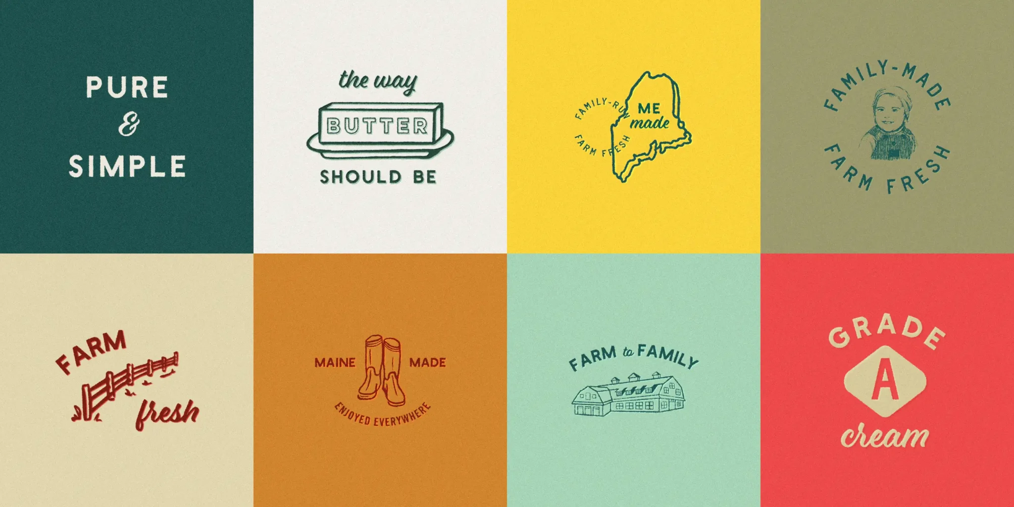
Brand Elements

Logo
A refined wordmark that maintains Kate's heritage while adding a touch of modern elegance.
Color Palette
Warm, natural colors inspired by Maine's pastoral landscapes and dairy farms.
Garamond Premier Pro
Avenir Next
Courier New
Typography
A classic, timeless type system that balances tradition with contemporary clarity.
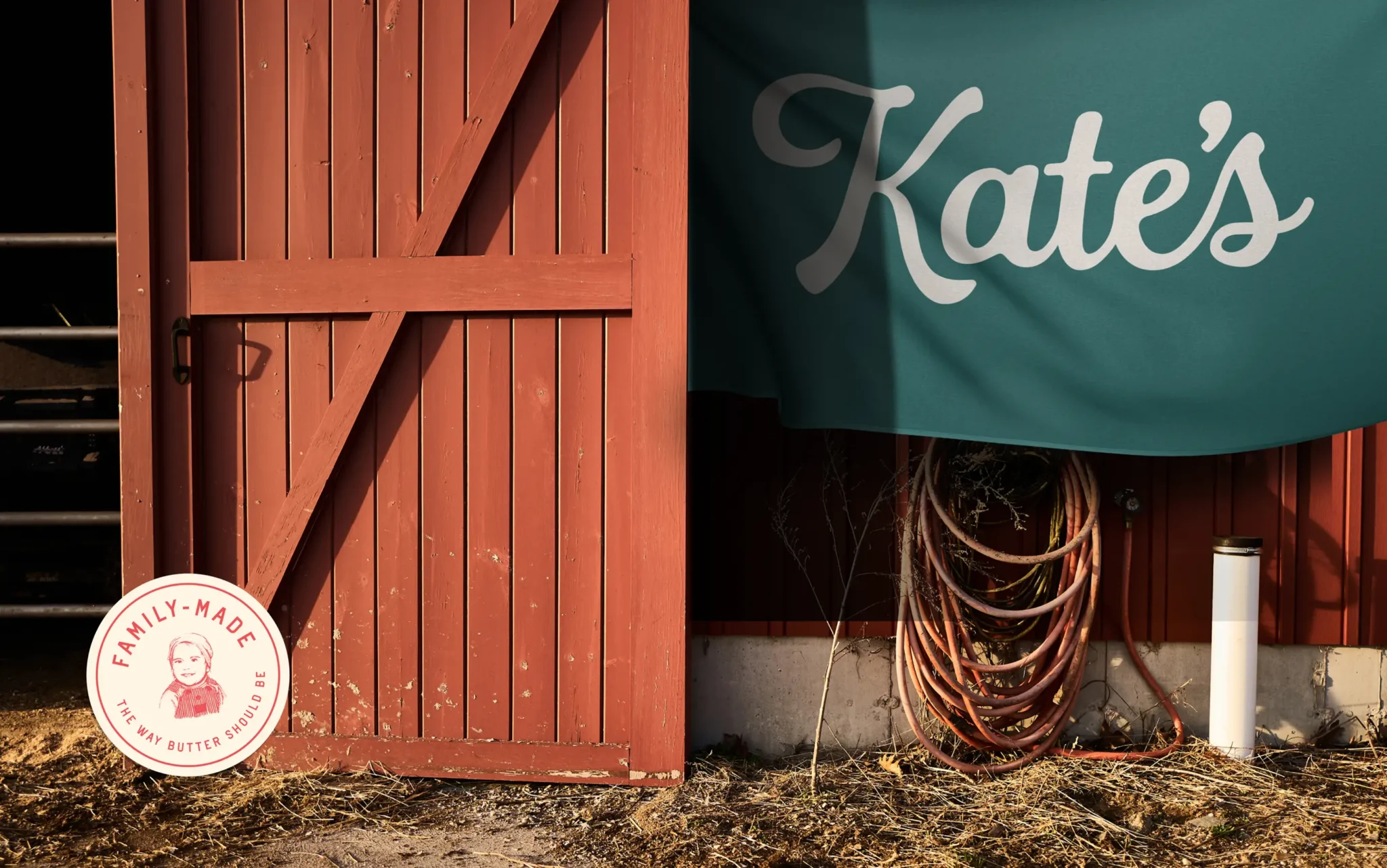
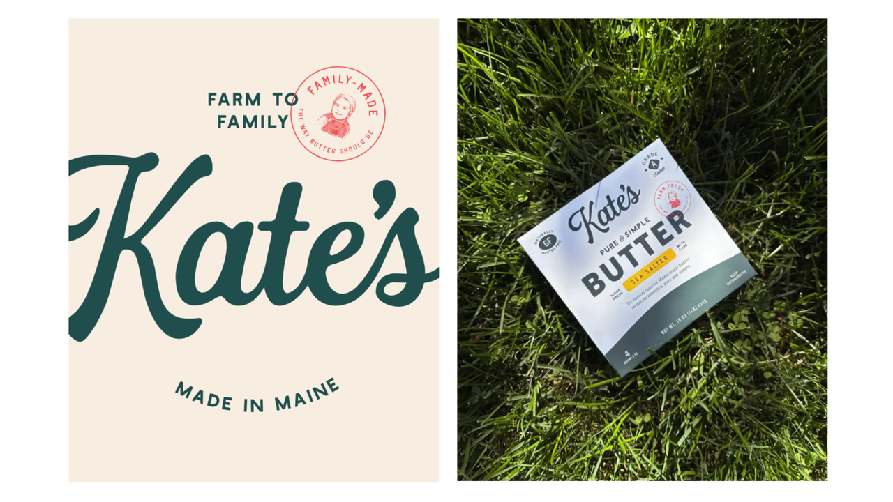
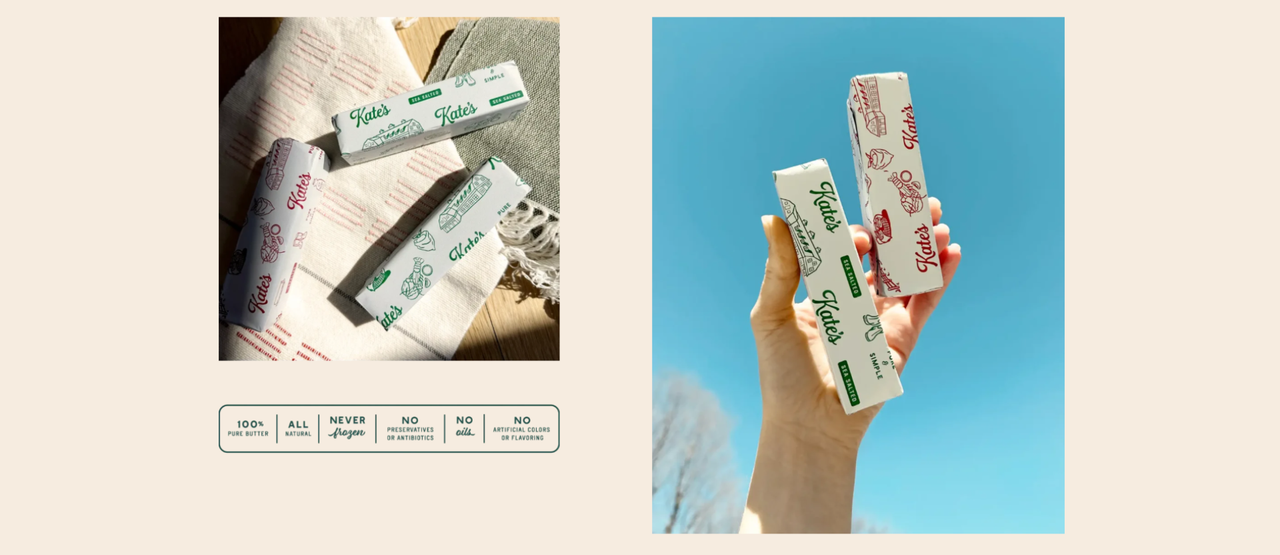
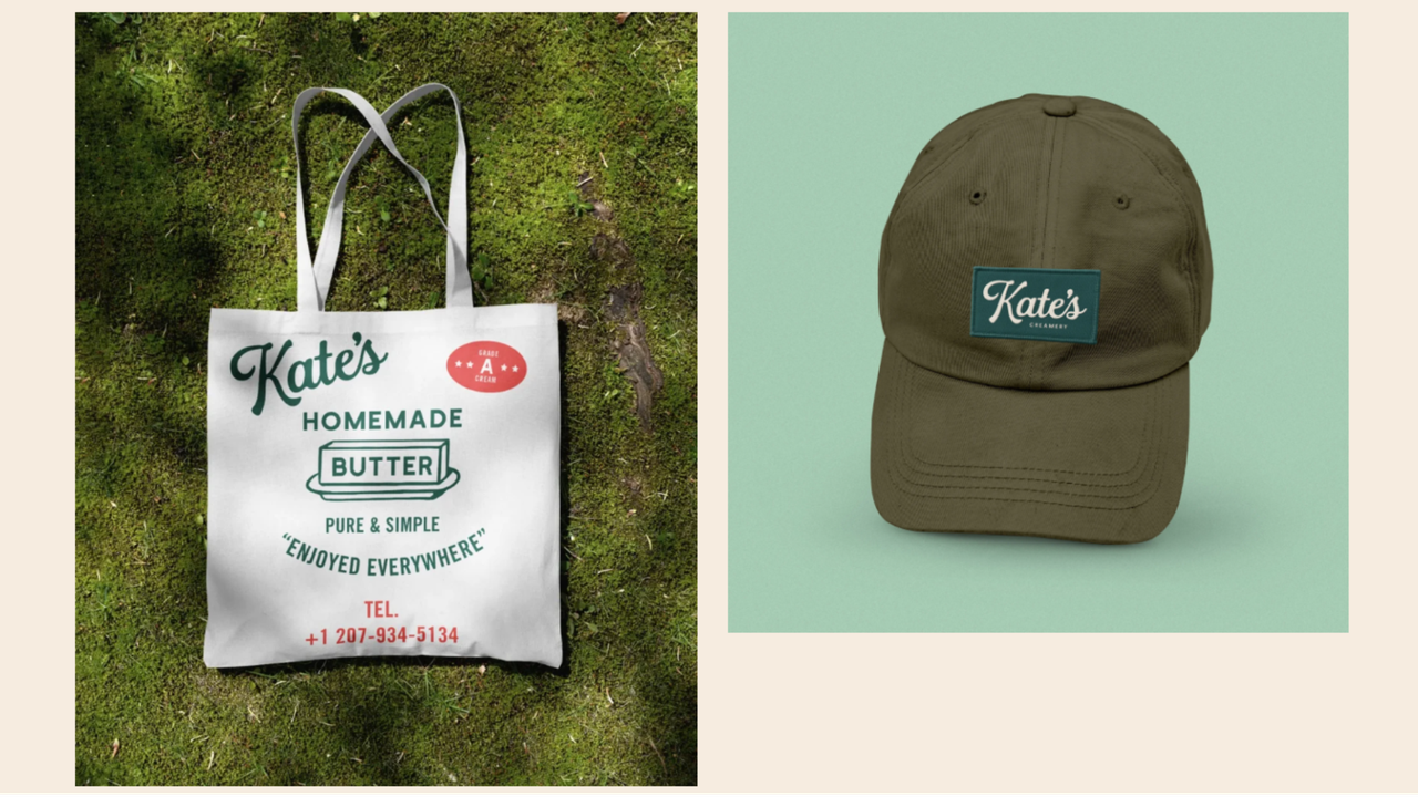
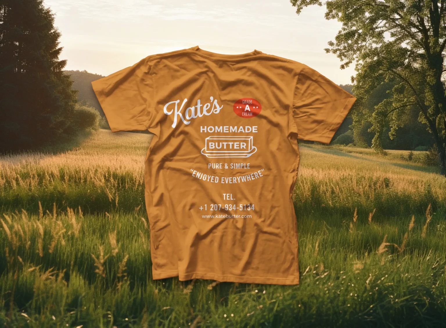
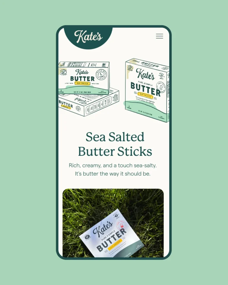
Packaging Design
The new packaging system was designed to create a strong shelf presence while communicating Kate's commitment to quality and tradition. Each product features a distinctive color code while maintaining a cohesive brand identity.
We incorporated subtle elements that reference Maine's agricultural heritage and natural beauty, creating an emotional connection with consumers who value authenticity and craftsmanship.


Results
32%
Increase in brand recognition
28%
Growth in new market sales
45%
Increase in social media engagement
"The team at Tecllo truly understood our heritage and values. They created a brand identity that honors our past while positioning us for future growth. The new packaging has been a game-changer for our retail presence."
Kate Smith
Founder, Kate's Butter
